- For enquiries contact us on:
- +44 20 8133 8180
- info@cuttergrp.com
Leveraging Freshdesk Analytics – Part 1
Cutter Help Desk Migration
16th January 2019Leveraging Freshdesk Analytics – Part 2
28th February 2020Leveraging Freshdesk Analytics – Part 1
Freshdesk recently held a webinar on their new Analytics functionality which will replace the old Reports feature. Due to time constraints they were quite light in detail on custom reports, so as an advocate of Analytics I wanted to share some details on how you can make use of these new tools within your business.
This is a two-part article, with this first part focussing on creating reports so your customers can see what you’re doing for them. The second part focusses on internal analytics and is available here.
We operate primarily a business-to-business model, supporting organisations with their IT infrastructure. Where we provide IT helpdesk functionality into these organisations, the customer typically requires information on key statistics and performance targets to ensure IT standards are being maintained.
Let’s look at what some of these statistics are, and how Freshdesk Analytics can automate the reporting of that data. For the sake of this article we’re going to assume you’ve managed to create a new custom report, and that you want to report on the data monthly.
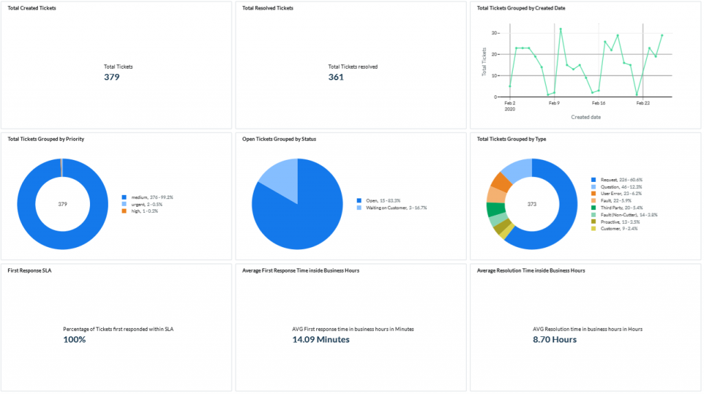
The first thing most customers want to know is how many tickets have been raised, when were they raised, and how many of them have been resolved. This is really simple to report on in Analytics by bringing in some basic widgets as follows.
A ‘Total Created Tickets’ statistic can be created with the just the basic Tickets metric, the Total value, and a Text chart, as shown.
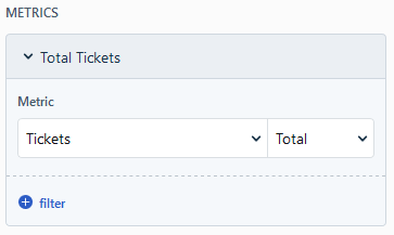
The ‘Total Resolved Tickets‘ is the same process, just change the metric from ‘Tickets’ to ‘Tickets resolved’.
For the ‘Date Tickets Created’ statistic we need to bring the ‘Grouped by’ variable into play and change the chart type to a Line chart:
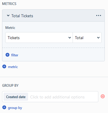
That should then give us a report that looks like this:

Next up let’s look at the Priority, Status and Type of ticket. ‘Tickets by Priority‘ is again the Tickets Total metric but now we group by Priority. This usually looks nicest as a Pie or Donut chart.
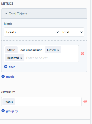
We already included a statistic to show how many tickets we’ve resolved, so we can make our ‘Tickets by Status‘ chart more useful by making it an ‘Open Tickets by Status‘ chart that only shows tickets which haven’t been resolved or closed. To do this was take our normal Tickets Total metric, but we add a filter to exclude the statuses we don’t want. We then group this information by Status and pick a chart style, noting that long status fields will be truncated in the Bar charts, so a Pie chart may work better here. I hope that Freshdesk will come up with a better solution for managing longer field names, as they are currently cut off after only a few characters in some of the charts.
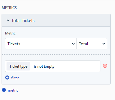
Our ‘Types of Ticket‘ chart is again a simple Tickets Total metric Grouped by Ticket type. If you do not require the Type field to be set on your tickets then you may find some tickets show up as ‘—‘. If you want to avoid these appearing in your reports, then add a filter that says ‘Ticket type is not empty’ and they will be excluded from the data included in the chart.
These three charts should end up looking like this:

Now let’s look at the KPIs that many organisations care about most – SLAs, response times, and resolution times.
Freshdesk have clearly thought about the SLA requirement and have a built-in metric for ‘Tickets first responded to within SLA’ and ‘Tickets resolved within SLA’. We’re going to make a ‘First Response SLA‘ chart by combining that first metric with the Percentage (rather than Total) value, and use a Text chart to give us a simple first response SLA percentage figure.
To expand on that SLA figure, we’re going to add a ‘Average First Response Time‘ chart to give a more relatable number. We use an average here rather than a range of times, because Freshdesk still has some scenarios where it can report an incorrect first response time even though SLA was met (e.g. if two tickets are merged in the wrong order), which in turn can make your data look wrong. We’re just going to use the ‘First response time in business hours’ metric and select the Average value, then set our chart to show in Minutes as Text. There are a number of SLA/Response metrics built into Analytics that are worth investigating if you need to report on this sort of information.
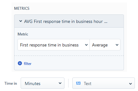
Our ‘Average Resolution Time‘ chart follows the same process where we use the ‘Resolution time in business hours’ metric and change our chart value to Hours.

Finally we’re going to look at top requesters, custom ticket fields, and tabular data.
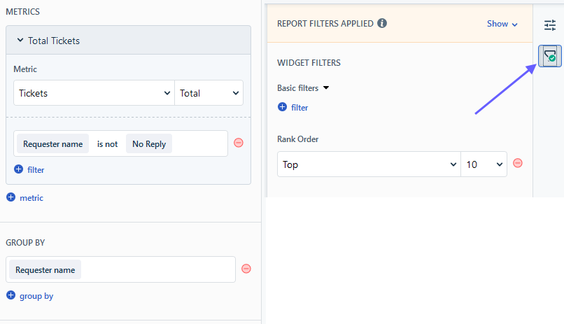
Freshdesk have thankfully seen the need for creating ‘Top #’ charts and this functionality is built in to Analytics. Let’s use it to show which contacts raise the most tickets by making a ‘Top 10 Requesters‘ chart. First we want the usual Tickets Total metric, then we want to Group by Requester Name. You may wish to exclude certain requesters to remove tickets from automated or internal systems, in which case you can add a filter for ‘Requester name is not…’. To just show the top 10 we need to switch from the Configure section to the Filter section and set our desired Rank Order and value.
Another plus for Analytics is that it natively handles any custom ticket fields you have created. We categorise our tickets into the relevant technology or system they are associated with, and we can easily show this information in a ‘Tickets by Category‘ chart by selecting our custom field in the Grouped by setting. This even supports dependent fields, so we can filter by one tier and group by a second tier. Like with Ticket Type, if you do not require this field to be set on your tickets, you can exclude blank tickets with a filter for ‘<field name> is not —‘. Be aware again that the bar charts will truncate long field names, so if you have these then another chart type may be more suitable.
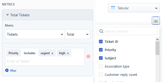
Finally let’s use the tabular data chart type to highlight specific tickets in a ‘High Priority Tickets‘ view. We select the Tickets Total metric as normal, then add a filter to select just the priorities we want. Once we have set the chart type to Tabular, you will see a gear icon that allows you to select the column headings you want to include in the table.
In the report these charts should look like this:

The final step is to set a top level Filter on your report to specify a Created Date range (or whatever range of data you need), and to narrow down the data as appropriate by filtering on Company, Group, or Product. You can then configure an automated export of the report on your desired schedule.
It’s important to remember that if you set any date range filters at the top level, you need to remove them from the individual charts. Many widgets when imported will include an ‘in the last 30 days’ setting by default. If you want to report on a different time scale then remove this from the chart settings completely and just set it on the report in one place.
That covers some of the most common statistics that a customer might expect you to report on and how to create them in Analytics. Analytics is still under active development by Freshdesk and they plan to roll out more new features in the coming months. I am particularly looking forward to the ability to add custom text fields so that reports can include written insight and discuss trends, highlights and challenges with the customer within the report itself.
